|
|
Help
Configure the Dynamic Layout of Your Products and Categories
Create pages to display your products and categories for you. During the setup process, you can determine how categories and products should display on those pages.
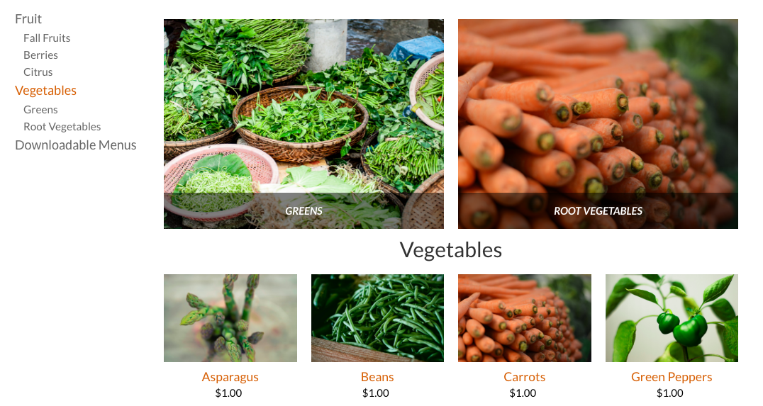
On Category pages by default, all category names display in the left sidebar, and sub-category images display in a grid. Products images display in a grid below the sub-categories.
You can change the layout of this page to display just the sidebar list or just the category images). You can also choose the number of columns used to display the images, and the aspect ratio for those images.
You can also configure the number of columns and the aspect ratio used for your products on a category page, and you can also set the number of products per page.
Tip: The aspect ratio sort of determines the size and shape of your image. A 4:1 ratio would make the image width 4x the size of the height. A 1:1 ratio creates a square. The default is 3:2, which means the width is just a bit larger than the height. Feel free to play around with this ratio until you find the right look for your store.
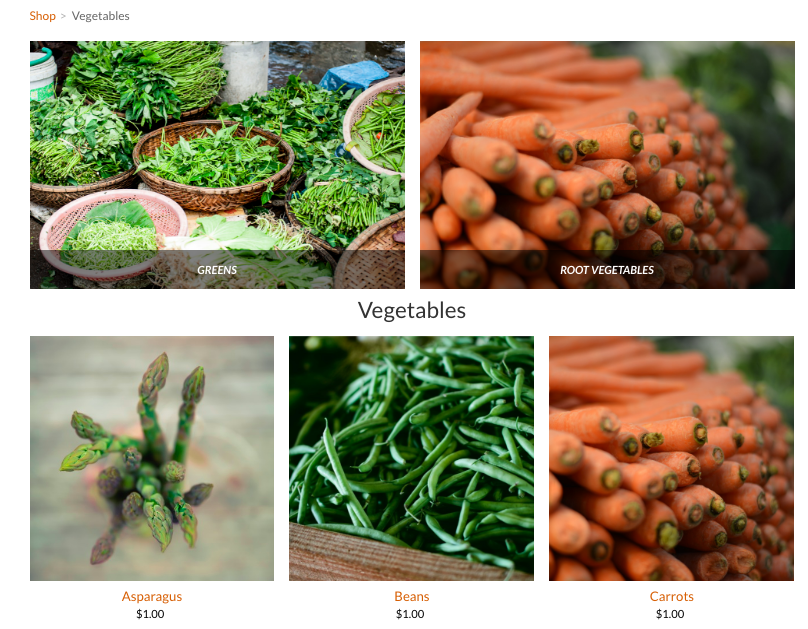
For example, this is the same Category page, but configured to display only category images (and not the sidebar) using a 4:3 aspect ratio and configured to display 3 columns of products at a 1:1 ratio.
To set the dynamic layout of store pages, configure the settings in the Layout area of the STORE > Setup page.
Tip: This layout configuration only affects the category pages. You can also use the Categories and Products elements to display your goods. These elements also allow you to determine things like the aspect ratio and number of columns to display.
Tip: This layout configuration only affects the category pages. You can also use the Categories and Products elements to display your goods. These elements also allow you to determine things like the aspect ratio and number of columns to display.
2010-2024. GBIZ ASIA .
A community based human edited Asia business directory
GBIZ ASIA is an initiative by SMB Grant Hub.
A community based human edited Asia business directory
GBIZ ASIA is an initiative by SMB Grant Hub.

